|
This page introduces the atomic hydrogen emission spectrum, showing
how it arises from electron movements between energy levels within the
atom. It also looks at how the spectrum can be used to find the
ionisation energy of hydrogen. What is an emission spectrum? Observing hydrogen's emission spectrum A hydrogen discharge tube is a slim tube containing hydrogen gas at low pressure with an electrode at each end. If you put a high voltage across this (say, 5000 volts), the tube lights up with a bright pink glow. If the light is passed through a prism or diffraction grating, it is split into its various colours. What you would see is a small part of the hydrogen emission spectrum. Most of the spectrum is invisible to the eye because it is either in the infra-red or the ultra-violet. The photograph shows part of a hydrogen discharge tube on the left, and the three most easily seen lines in the visible part of the spectrum on the right. (Ignore the "smearing" - particularly to the left of the red line. This is caused by flaws in the way the photograph was taken. See note below.) 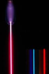 | |
|
Note: This photograph is by courtesy of Dr Rod Nave of the Department of Physics and Astronomy at Georgia State University, Atlanta. The photograph comes from notes about the hydrogen spectrum in his HyperPhysics pages on the University site. If you are interested in more than an introductory look at the subject, that is a good place to go. Ideally the photo would show three clean spectral lines - dark blue, cyan and red. The red smearing which appears to the left of the red line, and other similar smearing (much more difficult to see) to the left of the other two lines probably comes, according to Dr Nave, from stray reflections in the set-up, or possibly from flaws in the diffraction grating. I have chosen to use this photograph anyway because a) I think it is a stunning image, and b) it is the only one I have ever come across which includes a hydrogen discharge tube and its spectrum in the same image. | |
|
Extending hydrogen's emission spectrum into the UV and IR There is a lot more to the hydrogen spectrum than the three lines you can see with the naked eye. It is possible to detect patterns of lines in both the ultra-violet and infra-red regions of the spectrum as well. These fall into a number of "series" of lines named after the person who discovered them. The diagram below shows three of these series, but there are others in the infra-red to the left of the Paschen series shown in the diagram. The diagram is quite complicated, so we will look at it a bit at a time. Look first at the Lyman series on the right of the diagram - this is the most spread out one and easiest to see what is happening. 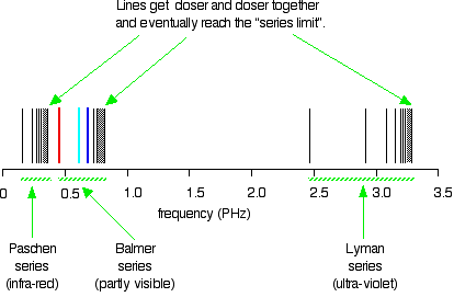 | |
|
Note: The frequency scale is marked in PHz - that's petaHertz. You are familiar with prefixes like kilo (meaning a thousand or 103 times), and mega (meaning a million or 106 times). Peta means 1015 times. So a value like 3 PHz means 3 x 10¹⁵ Hz. If you are worried about "Hertz", it just means "cycles per second". | |
|
The Lyman series is a series of lines in the ultra-violet. Notice
that the lines get closer and closer together as the frequency
increases. Eventually, they get so close together that it becomes
impossible to see them as anything other than a continuous spectrum.
That's what the shaded bit on the right-hand end of the series suggests. Then at one particular point, known as the series limit, the series stops. If you now look at the Balmer series or the Paschen series, you will see that the pattern is just the same, but the series have become more compact. In the Balmer series, notice the position of the three visible lines from the photograph further up the page. Complicating everything - frequency and wavelength You will often find the hydrogen spectrum drawn using wavelengths of light rather than frequencies. Unfortunately, because of the mathematical relationship between the frequency of light and its wavelength, you get two completely different views of the spectrum if you plot it against frequency or against wavelength. The relationship between frequency and wavelength The mathematical relationship is: 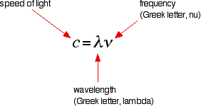 | |
|
Note: You will sometimes find frequency given the much more obvious symbol, f. | |
|
Drawing the hydrogen spectrum in terms of wavelength This is what the spectrum looks like if you plot it in terms of wavelength instead of frequency: | |
Saturday, 27 April 2013
THE ATOMIC HYDROGEN EMISSION SPECTRUM
Subscribe to:
Post Comments (Atom)


No comments:
Post a Comment